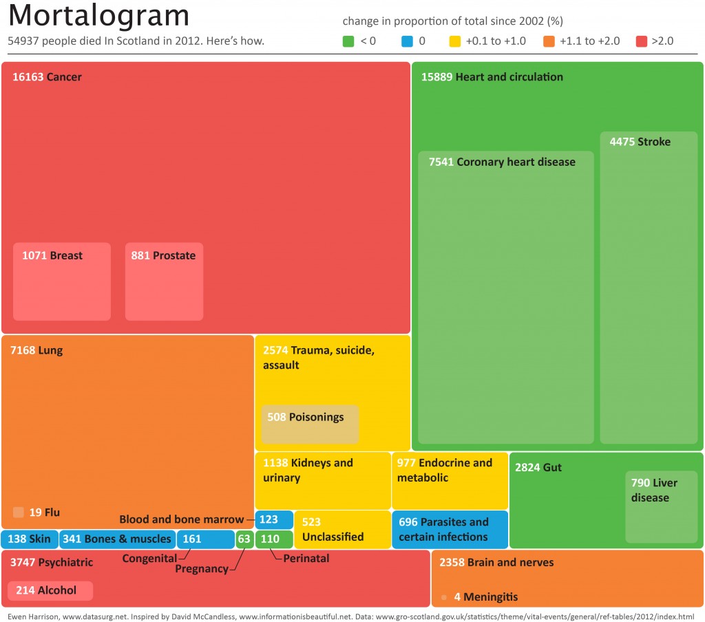
54937 people died In Scotland in 2012. Here’s how.
Life expectancy of acute hospital inpatients
I liked the study published this week by David Clark and Christopher Isles.
On 31st March 2010 there were 10,743 inpatients in 25 Scottish teaching and general hospitals.
One year later 3098 (29%) were dead.
That sounds a lot and is a lot. As the authors point out, the study is biased to long term inpatients as it is a prevalent sample (those in hospital) rather than an incident sample (those admitted to hospital). The latter would be more informative to us in surgery.
Another important observation: of those that died, 32% did so during the index admission.
Our acute hospitals are not set up to be good places to die. They could and should be better.
The focus of care may too often be cure, doctors treating illnesses rather than patients. We are fortunate to have excellent palliative care services within our hospital, but the recent media outrage on the Liverpool Care Pathway has left many clinicians uncertain when looking after patients at the end of life. There is no lack of compassion, but a definite of education. This must improve if care is to get better.
Finally, the study reports in the abstract and throughout that men were more likely to die than women. It is unusual that neither the authors, reviewers nor editors picked up that this statement is based on a non-significant result, odds ratio: 1.18, 95% confidence interval: 0.95–1.47. There is no gender effect in the final model.
Introduction of Surgical Safety Checklists in Ontario, Canada – don’t blame the study size
The recent publication of the Ontario experience in the introduction of Surgical Safety Checklists has caused a bit of a stooshie.
Checklists have consistently been shown to be associated with a reduction in death and complications following surgery. Since the publication of Atul Gawande’s seminal paper in 2009, checklists have been successfully introduced in a number of countries including Scotland. David Urbach and Nancy Baxter’s New England Journal of Medicine publication stands apart: the checklist made no difference.
Atul Gawande himself responded quickly asking two important questions. Firstly, were there sufficient patients included in the study to show a difference? Secondly, was the implementation robust and was the programme in place for long enough to expect a difference be seen.
He and others have reported the power of the study to be low – about 40% – meaning that were the study to be repeated multiple times and a true difference in mortality actually did exist, the chance of detecting it would be 40%. But power calculations performed after the event (post hoc) are completely meaningless – when no effect is seen in a study, the power is low by definition (mathsy explanation here).
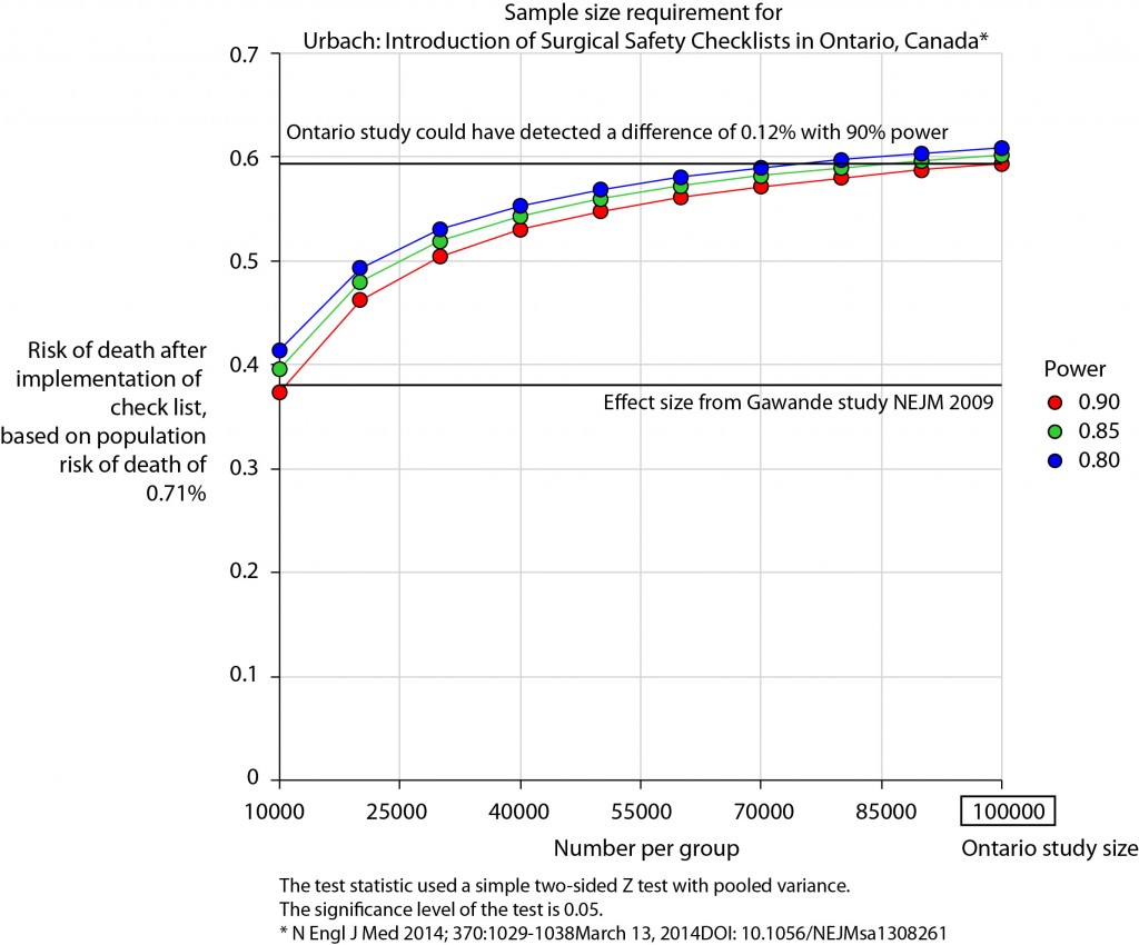
There is no protocol provided with the Ontario study, so it is not clear if an estimate of the required sample size had been performed. Were it done, it may have gone something like this.
The risk of death in the Ontario population is 0.71%. This could have been determined from the same administrative dataset that the study used. Say we expect a similar reduction in death following checklist introduction as Gawande showed in 2009, 1.5% to 0.8%. For the Ontario population, this would be equivalent to an expected risk of death of 0.38%. This may or may not be reasonable. It is not clear that the “checklist effect” is the same across patients or procedures of different risks. Accepting this assumption for now, the study would have only required around 8000 patients per group to show a significant difference. The study actually included over 100000 patients per group. In fact, it was powered to show very small differences in the risk of death – a reduction of around 0.1% would probably have been detected.
Similar conclusions can be drawn for complication rate. Gawande showed a reduction from 11% to 7%, equivalent in Ontario to a reduction from 3.86% to 2.46%. The Ontario study was likely to show a reduction to 3.59% (at 90% power).
The explanation for the failure to show a difference does not lie in the numbers.
So assuming then that checklists do work, this negative result stems either from a failure of implementation – checklists were not being used or not being used properly – or a difference in the effect of checklists in this population. The former seems most likely. The authors report that …
… available data did not permit us to determine whether a checklist was used in a particular procedure, and we were unable to measure compliance with checklists at monthly intervals in our analysis. However, reported compliance with checklists is extraordinarily high …
Quality improvement interventions need sufficient time for introduction. In this study, only a minimum of 3 months was allowed which seems crazily short. Teams need to want to do it. In my own hospital there was a lot of grumbling (including from me) before acceptance. When I worked in the Netherlands, SURPASS was introduced. In this particular hospital it was delivered via the electronic patient record. A succession of electronic “baton passes” meant that a patient could not get to the operating theatre without a comprehensive series of checklists being completed. I like this use of technology to deliver safety. With robust implementation, training, and acceptance by staff, maybe the benefits of checklists will also be seen in Ontario.


