This post comes with some big health warnings.
The recent events in Leeds highlight the difficulties faced in judging the results of surgery by individual hospital. A clear requirement is timely access to data in a form easily digestible by the public.
Here I’ve scraped the publically available data from the central cardiac audit database (CCAD). All the data are available at the links provided and are as presented this afternoon (06/04/2013). Please read the caveats carefully.
Hospital-specific 30-day mortality data are available for certain paediatric heart surgery procedures for 2009-2012. These data are not complete for 2011-12 and there may be missing data for earlier years. There may be important data for procedures not included here that should be accounted for. There is no case-mix adjustment.
All data are included in spreadsheets below as well as the code to run the analysis yourself, to ensure no mistakes have been made. Hopefully these data will be quickly superseded with a quality-assured update.
Mortality by centre
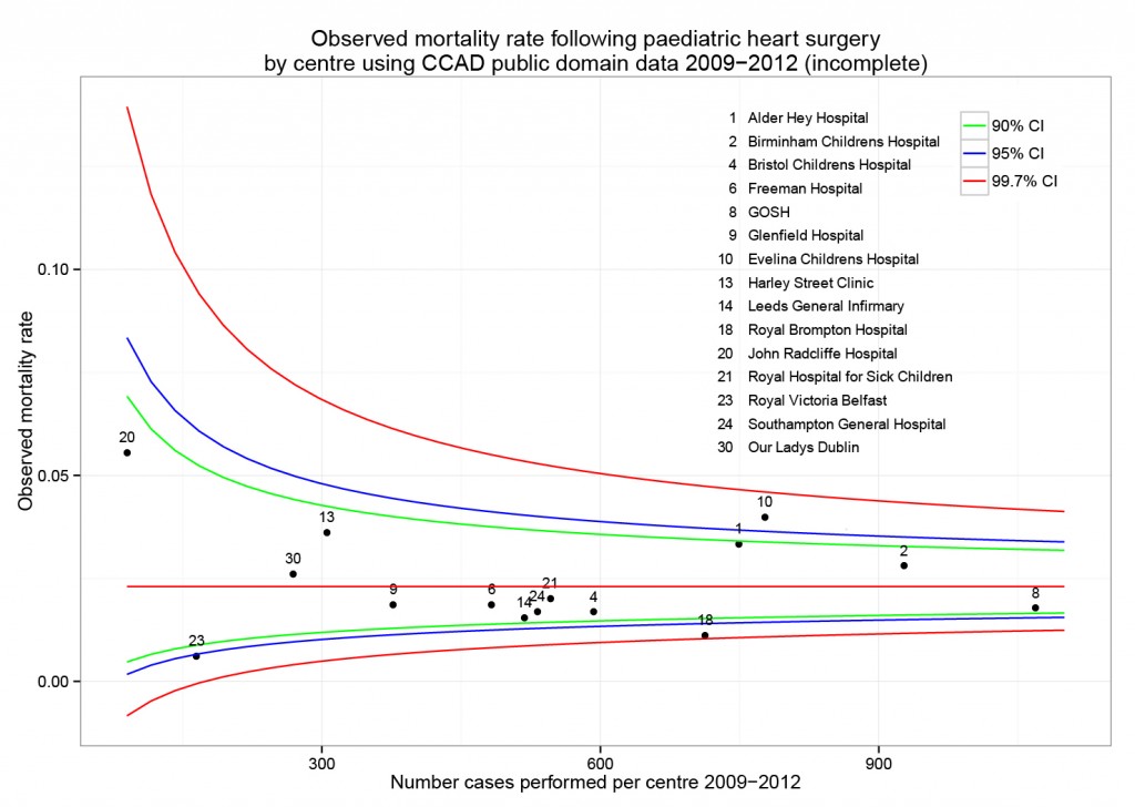
The funnel plot below has been generated by taking all surgical procedures performed from pages such as this and expressing all deaths within 30 days as a proportion of the total procedures performed by hospital.
The red horizontal line is the mean mortality rate for these procedures – 2.3%. The green, blue and red curved lines are decreasingly stringent control limits within which unit results may vary by chance.
Mortality by procedure
The mortality associated with different procedures can be explored with this google motion chart. Note when a procedure is uncommon (to the left of the chart) the great variation seen year to year. These bouncing balls trace out the limits of a funnel plot. They highlight why year to year differences in mortality rates for rare procedures must be interpreted with caution.
[cf]googleVis[/cf]
Data
ccad_public_data_april_2013.xls
ccad_public_data_april_2013_centre
ccad_public_data_april_2013_aggregate
ccad_public_data_april_2013_lookup
Script
####################################
# CCAD public domain data analysis #
# 6 April 2013                     #
# Ewen Harrison                    #
# www.datasurg.net                 #
####################################

# Read data
data<-read.table("ccad_public_data_april_2013_centre.csv", sep=",", header=TRUE)

# Correct variable-type
data$centre_code<-factor(data$centre_code)

# Read centre names table
centre<-read.table("ccad_public_data_april_2013_lookup.csv", sep=",", header=TRUE)

# Combine
data<-merge(data, centre, by="centre_code")

# Subset by only procedures termed "Surgery" and remove procedures with no data.
surg<-subset(data, type=="Surgery" & !is.na(data$centre_code))

# Display data
surg
str(surg)

# install.packages("plyr") # remove "#" first time to install
library(plyr)

# Aggregate data by centre
agg.surg<-ddply(surg, .(centre_code), summarise, observed_mr=sum(death_30d)/sum(count),
  sum_death=sum(death_30d), count=sum(count))

# Overall mortality rate for procedures lists in all centres
mean.mort<-sum(surg$death_30d)/sum(surg$count)
mean.mort #2.3%

# Generate binomial confidence limits

# install.packages("binom") # remove "#" first time to install
library(binom)
binom_n<-seq(90, 1100, length.out=40)
ci.90<-binom.confint(mean.mort*binom_n, binom_n, conf.level = 0.90, methods = "agresti-coull")
ci.95<-binom.confint(mean.mort*binom_n, binom_n, conf.level = 0.95, methods = "agresti-coull")
ci.99<-binom.confint(mean.mort*binom_n, binom_n, conf.level = 0.997, methods = "agresti-coull")

# Plot chart
# install.packages("ggplot2") # remove "#" first time to install
library(ggplot2)
ggplot()+
	geom_point(data=agg.surg, aes(count,observed_mr))+
	geom_line(aes(ci.90$n, ci.90$lower, colour = "90% CI"))+ #hack to get legend
	geom_line(aes(ci.90$n, ci.90$upper), colour = "green")+
	geom_line(aes(ci.95$n, ci.95$lower, colour = "95% CI"))+
	geom_line(aes(ci.95$n, ci.95$upper), colour = "blue")+
	geom_line(aes(ci.99$n, ci.99$lower, colour = "99.7% CI"))+
	geom_line(aes(ci.99$n, ci.99$upper), colour = "red")+
	geom_text(data=agg.surg, aes(count,observed_mr,label=centre_code), size=3,vjust=-1)+
	geom_line(aes(x=90:1100, y=mean.mort), colour="red")+
	ggtitle("Observed mortality rate following paediatric heart surgery\nby centre using CCAD public domain data 2009-2012 (incomplete)")+
	scale_x_continuous(name="Number cases performed per centre 2009-2012", limits=c(90,1100))+
	scale_y_continuous(name="Observed mortality rate")+
	scale_colour_manual("",
		breaks=c("90% CI", "95% CI", "99.7% CI"),
		values=c("green", "blue", "red"))+
	theme_bw()+
	theme(legend.position=c(.9, .9))

# Google motion chart
# Load national aggregate data by procedure
agg_data<-read.table("ccad_public_data_april_2013_aggregate.csv", sep=",", header=TRUE)

# check
str(agg_data)

# install.packages("googleVis") # remove "#" first time to install
library(googleVis)
Motion=gvisMotionChart(agg_data, idvar="procedure", timevar="year",
	options=list(height=500, width=600,
		state='{"showTrails":true,"yZoomedDataMax":1,"iconType":"BUBBLE","orderedByY":false,"playDuration":9705.555555555555,"xZoomedIn":false,"yLambda":1,"xAxisOption":"3","nonSelectedAlpha":0.4,"xZoomedDataMin":0,"iconKeySettings":[],"yAxisOption":"5","orderedByX":false,"yZoomedIn":false,"xLambda":1,"colorOption":"2","dimensions":{"iconDimensions":["dim0"]},"duration":{"timeUnit":"Y","multiplier":1},"xZoomedDataMax":833,"uniColorForNonSelected":false,"sizeOption":"3","time":"2000","yZoomedDataMin":0.33};'),
		chartid="Survival_by_procedure_following_congenital_cardiac_surgery_in_UK_2000_2010")
plot(Motion)


